

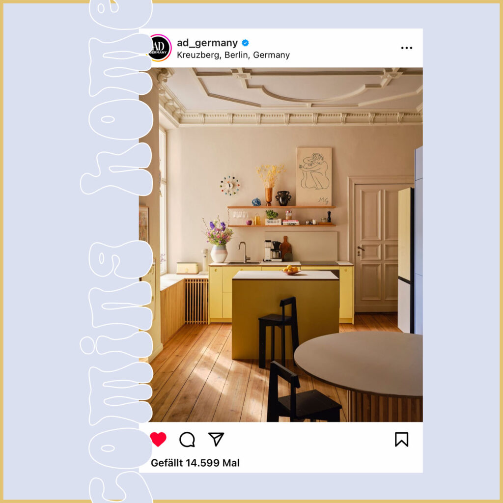
Pictures of the renovated kitchen: Volker Conradus for AD Germany.
She’s only lived there for two years and is already renovating everything?I hear some readers among you whispering, rolling their eyes. And yes, it’s true: 2.5 years, to be precise. I’ve been stuck in our apartment with my gang for so long now. And yet my Candy Land aka my kitchen was really annoying me. Because after a short time I realized that the “Yellow Kitchen” project was somehow slipping away from me.
– This post contains affiliate links and product placements. The project was completed thanks to the color advice and paint provided by Farrow & Ball realized.
You can find more information about this here –
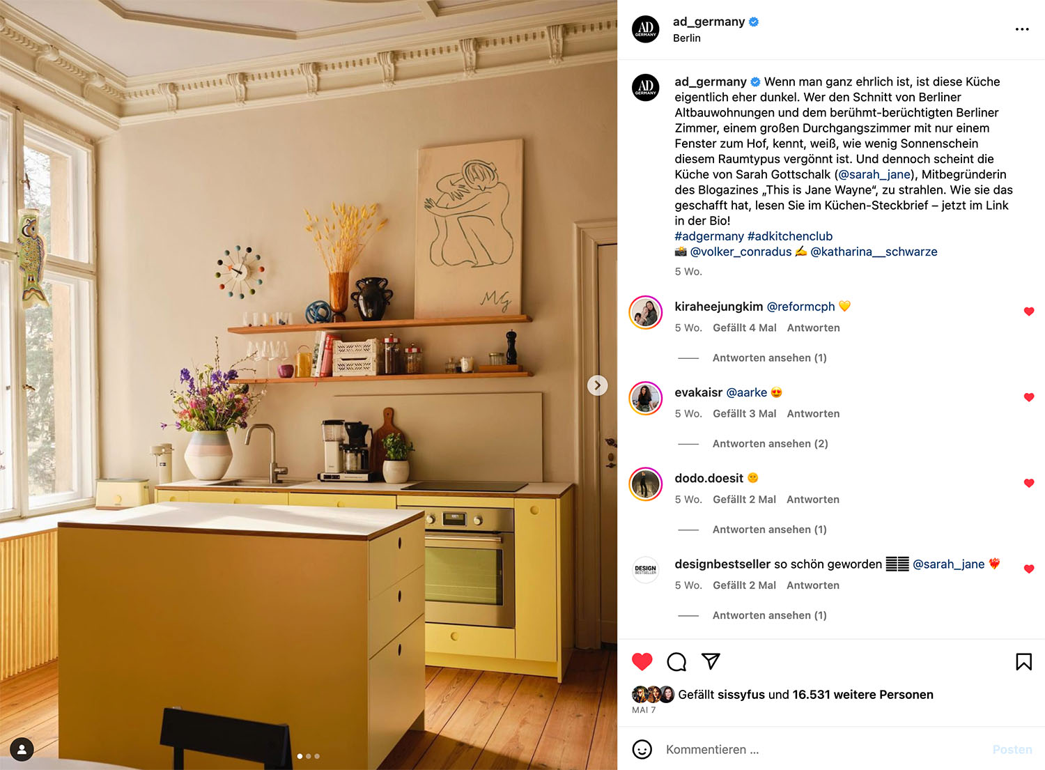

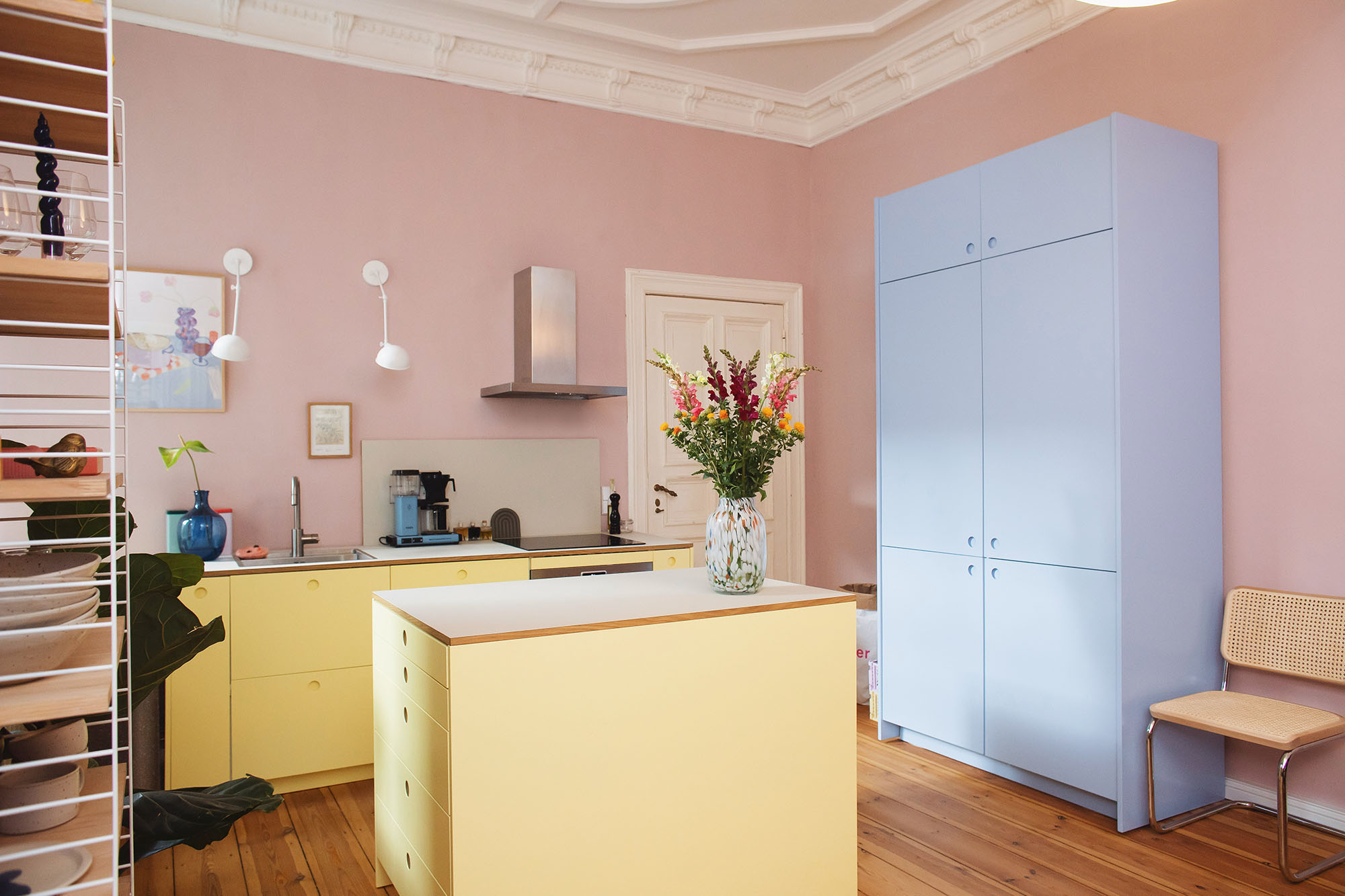
The yellow of the kitchen wasn’t the problem, but everything else that influenced it. Or let’s say: the interaction. If I compare the pictures from “before” with the pink on the wall with the much calmer beige of today, then I hardly recognize this room:
Everything was suddenly so bright, now it’s quiet. The entire room seemed flat, today I see structure and dimensions. I am completely inspired by the sight of my kitchen and, above all, infinitely grateful for the experienced eye and knowledgeable opinion Farrow & Ball Color Coordinator Julia Wülfing, who really surprised me with her color combination suggestions for the walls. Maybe I wasn’t the easiest customer Julia has ever advised, after all, at some point I decided undecidedly on a color composition for the walls, doors and the ceiling, only to completely throw the result over the top once the painting was finished.

But maybe I needed this process to see and understand. To understand what I want and what I don’t want at all. The first result was too dark, too oppressive for me. But how should you help someone who didn’t know exactly what they wanted? Who couldn’t express himself properly and rambled vaguely about lightness? Nevertheless, something clicked, because just like that, Julia came up with her plan B and made big changes with small corrections. And the result is as follows:
- the earthy and warm tone Stirabout for the walls, the skirting boards and the doors
- the fresh and delicately bluish tone Dimpse for the ceiling
- School House White for the piece
It was important to me that the yellow of the reform kitchen in combination with the tones on the wall didn’t appear too bright, but remained soft and warm – and I think that worked quite well, what do you think?
Previously:

Afterward:
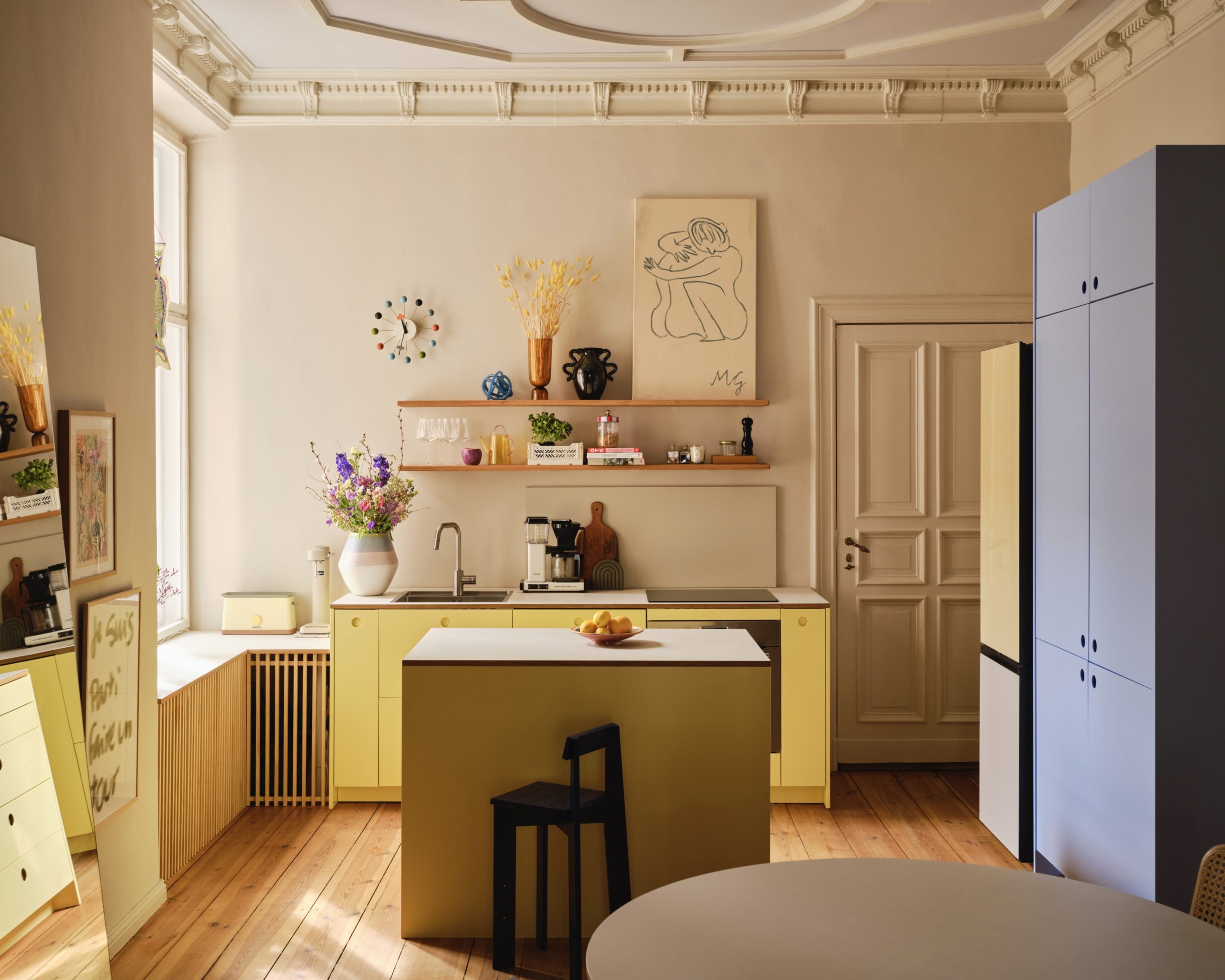

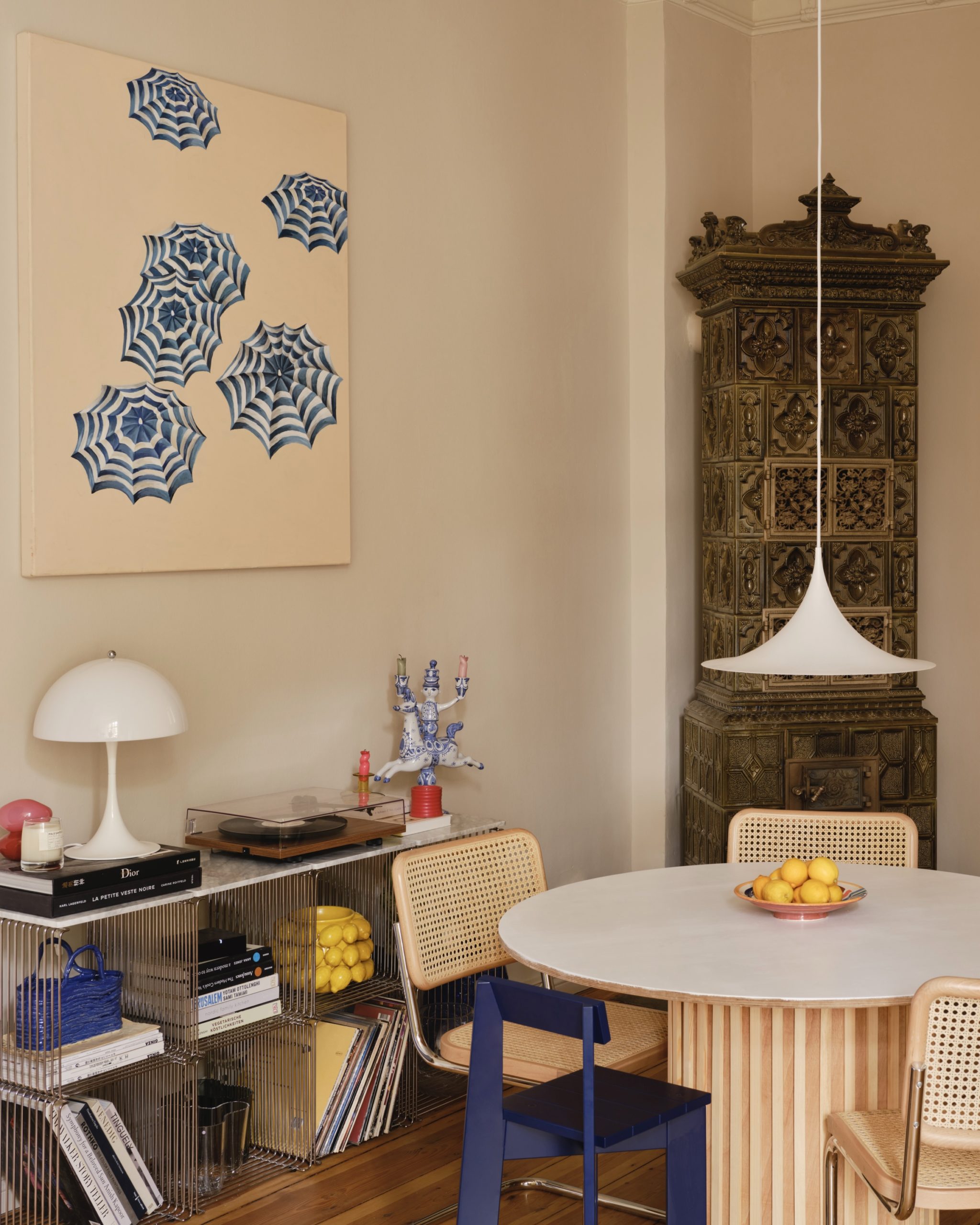
What else happened? A lot of things! The white lamps on the back wall had to go and were replaced with two oak boards from Holz-Lieblinge. Spotlights from IKEA now shine underneath, which we combined with the socket and produce wonderfully warm light. The extractor hood had to go and hasn’t been missed at all since then, we covered the heating with wooden slats and gives off wonderful heat in the winter. A larger mirror from MySpiegel was moved in and gave the dark room a little more space, the children’s triptraps were replaced with more delicate ferm Living children’s chairs and a classified ad find now hangs above the table: the pendant lamp from Gubi. We also decorated the self-made table with leftover strips from the heating panel and the love Monja Gentschow was so kind and lent me two of her beautiful paintings. The AD finally announced itself and everything was supposed to be almost perfect.
I feel like the space has found itself. Everything is in harmony with each other and ensures the peace that I so much wanted in this room. At the same time, the wall color gives me the freedom to integrate other colors in the form of accessories or furniture. I’m much less determined now – and you can imagine that’s particularly good for me. I’m excited to hear what you say!
A few accessories from my kitchen to shop for |